The New Lightning App
by Tankred Hase
Today we’re excited to announce the release of the new version of our Lightning desktop app. This release includes a complete redesign and optimized backend targeted toward light clients.
In a recent post we covered Lightning UX from a high level perspective and discussed which components and infrastructure would be required for a Lightning Network that is not only reliable but also usable by average users. In this post, we’ll highlight one crucial component of that puzzle, namely the Lightning App, which is our user-facing wallet application.
We had previously released an early prototype of our Lighting desktop app, but this release represents a complete rewrite of that code with security, simplicity, and testability in mind. We also redesigned the user interface to make the app more approachable for novice bitcoin users.
What differentiates this wallet from other apps
Many early adopters of Lightning are currently running their own lnd+bitcoin full nodes and we often get the question if they will be able to connect to their current node using the new app. So we wanted to take a minute to explain what differentiates this new release from other apps that are currently already out in the market today.
The redesigned Lightning App bundles lnd and is meant to run as a standalone wallet in light client mode (using Neutrino, BIP 157 + 158) both on desktop as well as mobile devices. By default the app will connect to a bitcoin full node cluster hosted by Lightning Labs. As Neutrino support progresses however, we will remove our hosted cluster. Optionally, users can also run their own full node and have the app connect to it if they want to. Users do not however need to run a separate lnd node. The goal is to build an application that is easily approachable and that can simply be opened with a double click.
The app will likely keep its minimalist design and not have as many features as other wallets targeted towards pro users. We feel there is a valuable learning experience to be had by making the Lightning protocol more accessible to novice users and learning about potential UX pitfalls along the way. If we can’t make the protocol accessible to this group of users then the technology will likely never move beyond the enthusiast market segment. So in many ways this new application represents both an experiment as well a foundation for future UX research around Lightning.
The bank metaphor
To make the concept of Lightning approachable but still secure, the app conveys the concept of a checking account to the user’s cold storage savings. This analogy allows users to follow the best practice of keeping the vast majority of their savings in cold storage and fund their Lightning wallet only with the funds that they might need for day-to-day transactions.
Security implications
The reason for this analogy is very simple. The Lightning app is installed on a device that is connected to the internet and is therefore considered a hot wallet. Since these devices are susceptible to a variety of attacks, security best practices for Bitcoin dictate that users should not put large amounts of money into a hot wallet. Users can, however, put the required funds for day-to-day transactions into a hot wallet, balancing risk and convenience.
The importance of good UX for security
Security goes hand in hand with good design. Design isn’t just about the visual aesthetics of a product but also about how the product works. Making good tradeoffs on behalf of the user and guiding them along the way by making tough decisions for them is both good design and good for security. In the following section, we’ll cover some UX guidelines that ensure security best practices.
Use plain english
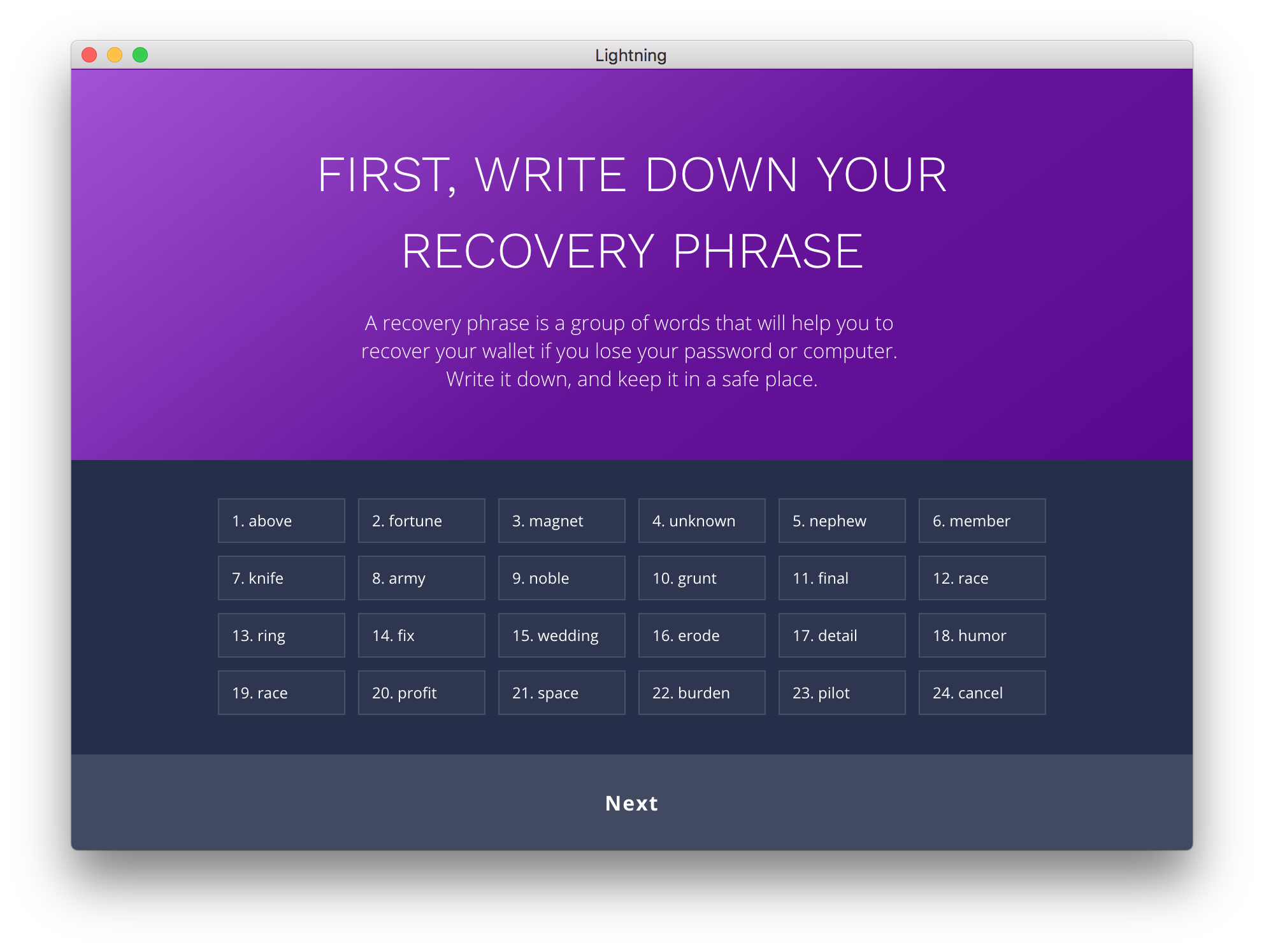
As Bitcoin and Lightning are reliant on complex cryptographic protocols, it’s essential to expose only what’s necessary to users and give a clear explanation of what’s going on. In the screenshot above, we use the wording “Recovery Phrase” instead of “Mnemonic Seed” which is often found in other wallet apps. Not only does this describe to the user why this is important in a clear manner, it’s also terminology that might be familiar to the user from Hardware wallets like Ledger or the Apple account “Recovery Key”.
Color, contrast, and visual communication
To distinguish between primary user actions and technical details, we employed a high contrast color shift. When users move to more complicated tasks like channel management or CLI, they move to what we call “Dark Mode”. This sudden shift from the rich color of primary screens, to a midnight purple, not only indicates to the user that what they are doing here is fundamentally different from what they were doing before, but also improves legibility of the dense amounts of information they will need to parse.
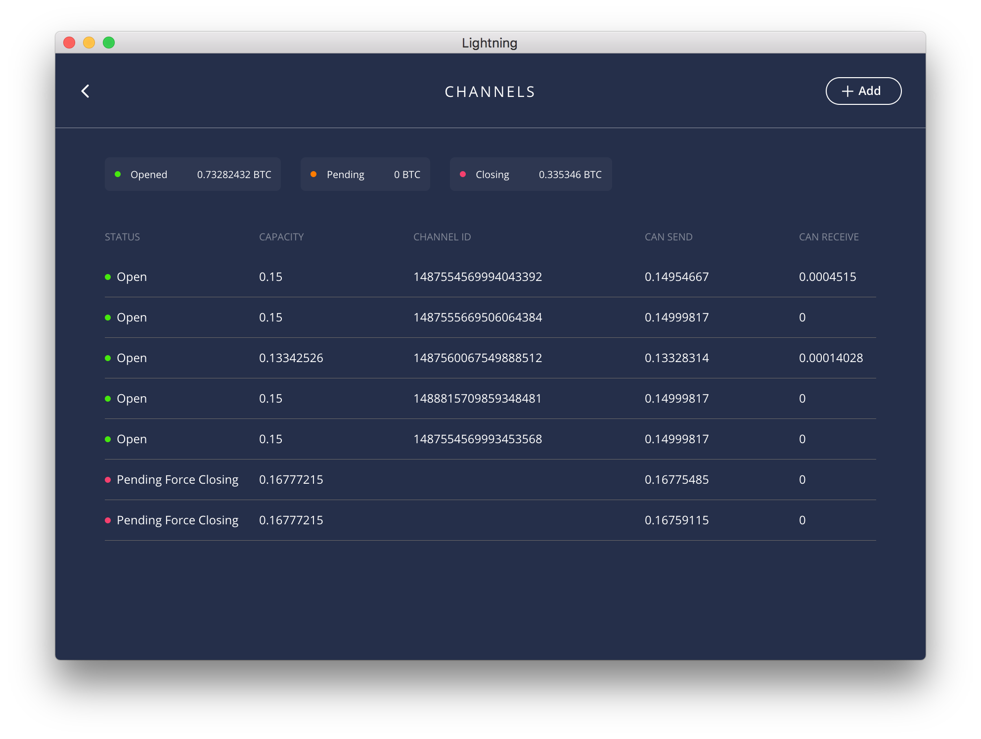
In the screenshot of the channels list the user can see where their funds are currently allocated. Our intention is for dark mode screens to become less prominent over time as the Lightning protocol and infrastructure matures to the point that users don’t have to worry about them at all and payments “just work”.
Limit funds per channel
Another measure the app takes to limit risk for the user is by limiting Lightning channel funds to 0.16 BTC. This is currently a precautionary measure taken by all BOLT implementations until the Lightning Network and its underlying infrastructure are stable and mature enough.
Automatically handle address & invoice
Another step we take to reduce friction for the user is to ensure the Lightning payment experience is similar to the user experience of an on-chain payment.
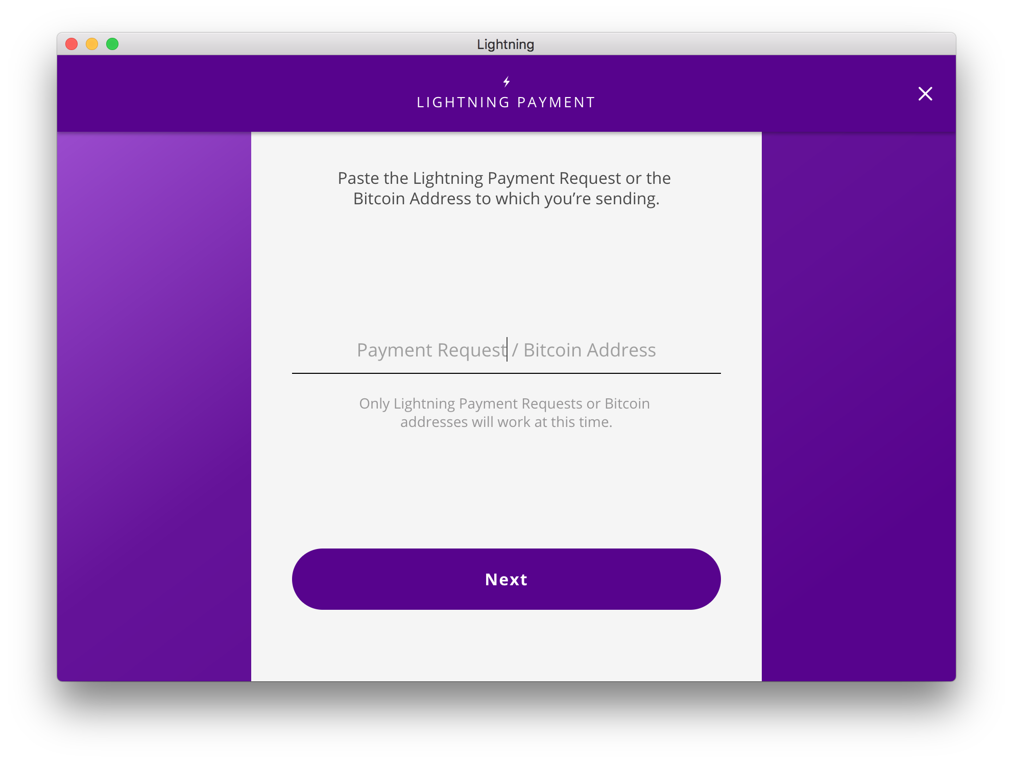
The user can simply paste either a bitcoin address or a Lightning invoice into the payment screen and the app will simply take the correct action for the user.
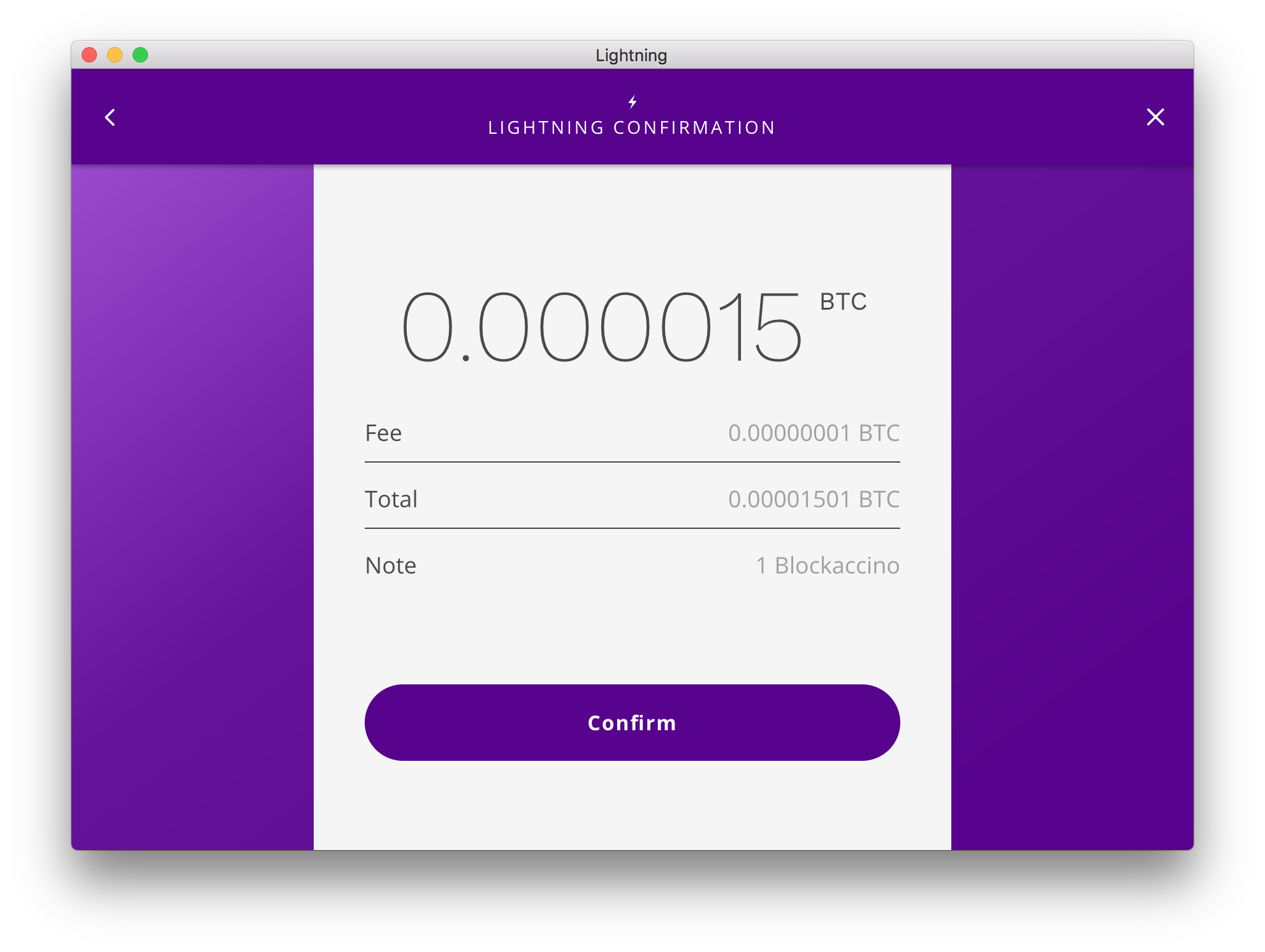
If a Lightning invoice is pasted in, its parameters are displayed for confirmation. If the user pastes a regular on-chain address, they will be greeted with a clear and distinct orange screen warning them that they are about to initiate an on-chain transaction.
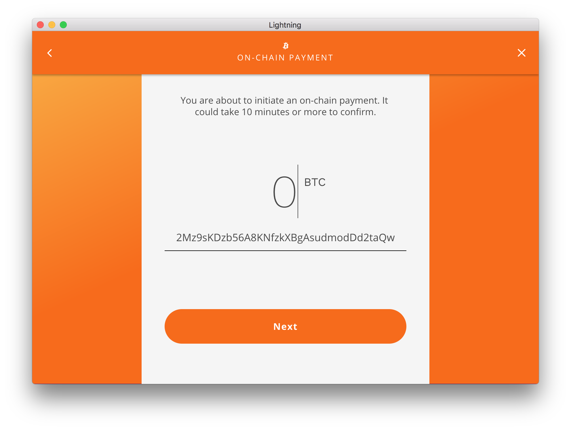
You might have noticed more shifts in color in the above screenshots. This is another example of using general visual cues to let the user know the contextual nature of the actions they are performing. Purple typically means they are performing off-chain functions, while orange means they are performing on-chain functions. While abstract, we hope these uses of color and contrast will make important contexts more visible to our users.
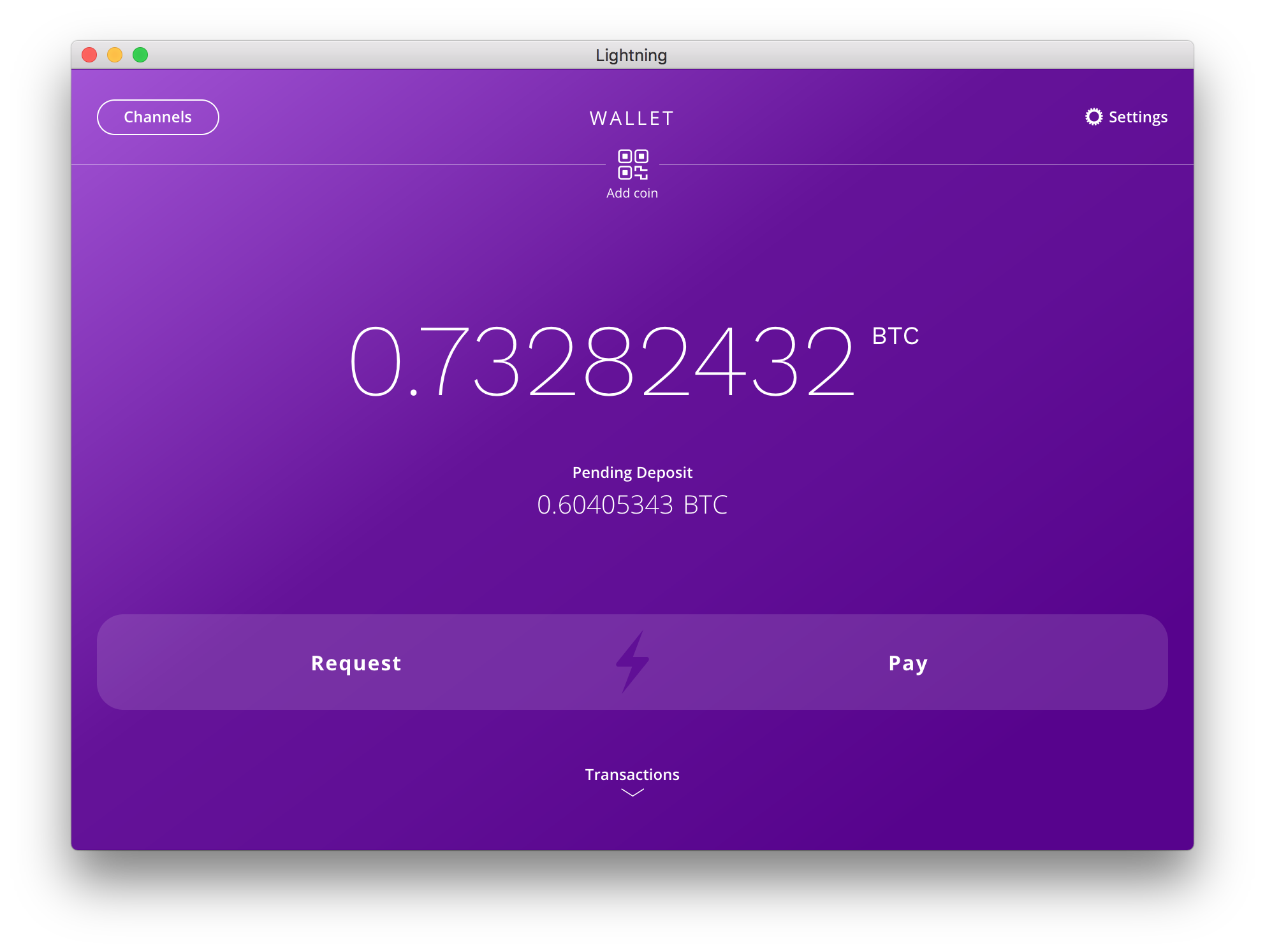
Display local fiat currency by default
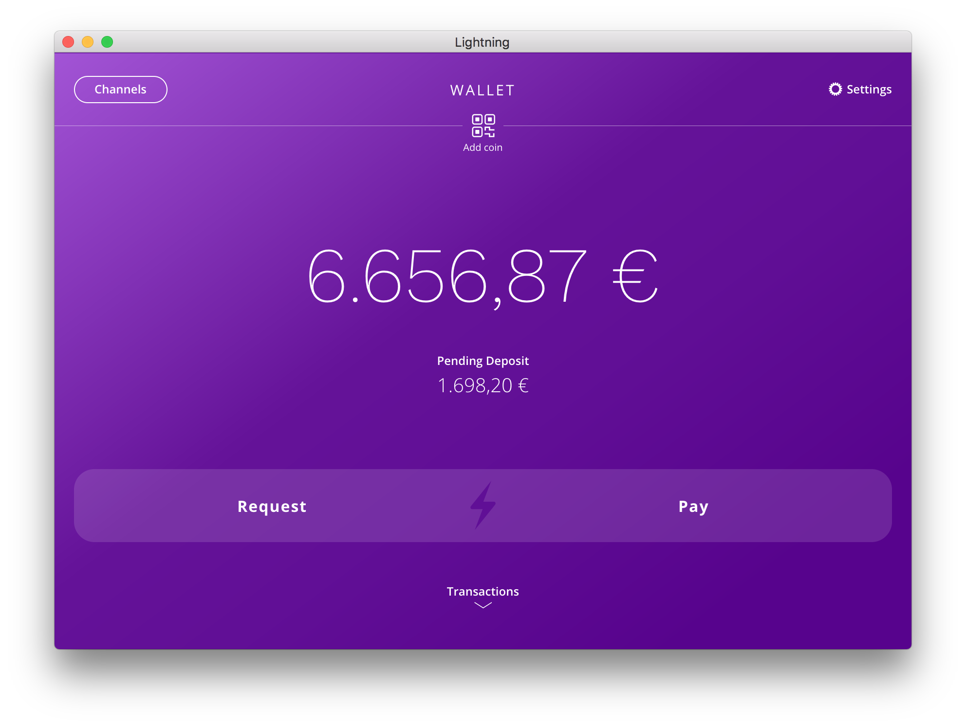
Although users can easily toggle between fiat or BTC with a click on the home screen, we’re planning to experiment with displaying the user’s local fiat currency by default. The reasoning behind this is the following:
- BTC is currently used mainly as a store of value and Lightning is an improvement on the medium of exchange use case. But Fiat is currently still a more usable unit of account in the sense that people think in fiat to estimate value: “this beer costs 3,00€”.
- UX research on changing settings shows less than 5% of users change the default settings. Only the minority of power users change settings, so advanced bitcoiners can easily switch anyway.
- Displaying prices in fiat might help average users understand the value proposition better. Sending a payment in USD from a US user to someone based in Germany (who will see Euros) might be obvious to folks in the Bitcoin space. But newcomers, especially people who travel a lot, will instantly see the value.
These are just some of the ways we’re seeking to achieve a good balance between usability and security. We’ll continue to try and improve upon the initial design in our upcoming releases based on feedback and UX research.
A note on routing and channel advertisement
Payment channels opened by the app are not advertised, as user agents will likely have limited uptime. This differs from routing nodes on servers or other hosts that are running 24/7. Though the app is still able to receive payments by adding routing hint information in the invoices it creates. We hope that other user agents follow the same guidelines as this helps to create a more reliable routing node infrastructure and increases user privacy. For more details on this, you can take a look at our recent post on routing.
Try the alpha release on testnet today!
This concludes our overview of our new desktop app. The application code is open source and licensed under GPLv3. To try the alpha release on testnet, just do the following:
- Download the latest release for your OS: https://github.com/lightninglabs/lightning-app/releases
- Head on over to a faucet and fund your wallet with testnet BTC: https://testnet.coinfaucet.eu/en/
- Wait a few minutes for the wallet to sync. Once completed, the app will open payment channels automatically. The funding transactions need to confirm just like regular on-chain transactions.
- Go to a site that supports Lightning like Yalls and buy something: https://testnet.yalls.org
That’s it!
Our releases are signed by Lightning Labs and have auto update enabled. Considering that users will likely keep small amounts of pocket money in their wallet, we feel that this solution offers a good compromise between security and convenience while keeping users up to date with the newest security patches. If users don’t feel comfortable with this setup, they can also build the app from the source code (which won’t trigger auto update).
We’re excited to hear your feedback as this release just represents the first step in an ongoing conversation with users. You can reach us by opening an issue on GitHub or our other developer resources. Thanks in advance for your input!
A note about the Bitcoin Testnet: Over the last few weeks, Bitcoin’s testnet3 has become unstable, with unpredictable fees, SegWit transactions being inconsistently mined and faucets shutting down. Because of this, testing with the Lightning App isn’t as seamless as we would like it to be. For subsequent testnet releases, we’ll be doing further research into how these issues can be mitigated, but until then, setting up Lightning App may be slower and less predictable than expected. If you’re encountering issues and/or have questions, please join the #lightning-app room in the lnd Slack.
Acknowledgements
Last but not least I wanted to mention a few key people that have made the new app possible…
Our designer @leegordon for his amazing work on balancing simplicity and technical complexity.
Our software engineer @vallywal who has been working tirelessly to make this release possible.
The entire Lightning Labs development team that has been patiently listening to feedback and polishing the protocol layer with crucial performance work.
And finally our leadership and investors who have given us the autonomy and trust to work on crazy and bold ideas.